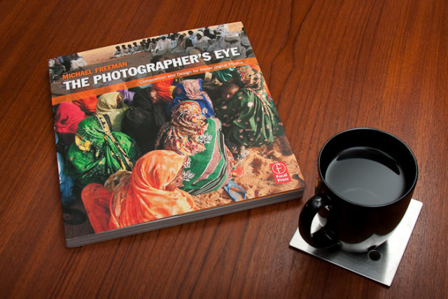
The Photographer’s Eye: Composition and Design for Better Digital Photos Review
I had been looking for a good solid text that explained the what and why of making strong images. The Photographer’s Eye by Michael Freeman is that book. This book isn’t another one of those introductory how to take a better picture books; it doesn’t talk at all about how a camera works or how to change settings or what exposure is. In fact it only touches on technical aspects, like focal length, aperture or shutter speed, when they affect how an image is composed.
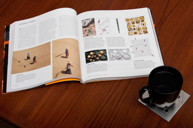
Physically the book is solidly put together, it’s a full-color soft-cover book, that feels well bound and solid in the hand. The cover is heavy coated paper, and it’s 192 pages are printed on heavy luster paper. The printing it’s self is clean, sharp and legible, and the photographs are also well reproduced. Overall the book feels solid and well put together, and handles well when reading whether on a table or laying down.
Don’t be mislead by the sub-title, the contents of this book apply to any kind of photography, film or digital. Actually the book doesn’t address anything that’s specific to digital photography or a digital work flow at all. In fact, the techniques presented here can be applied to any style as well, this isn’t a guide to better street, still-life or wildlife photography either. Rather is a guide to understanding how the images themselves work.
The content is broken down into 6 chapters; Image Frame, Design Basics, Graphic and Photographic Elements Composing with Light and Color, Intent and Process. The first four chapters address the graphical design aspects of the image itself. In other words, how leading lines, cropping and color, to name a few, affect the balance, flow and feeling of the image. The last two chapters deal with the photographer’s process and intent and focus more on visual story the photographer is trying to convey and how to convey it.
Each subject is covered by a few paragraphs of text, often no more than a page or two, and several photographs with accompanying illustrations and descriptions explaining how the technique discussed works in each photograph. The text serves as an introduction and overview of each topic and how to use it to affect the feel of an image. The real meat though is in the photographs and accompanying diagrams and captions showing and then explaining how a given technique worked in a given picture. For example in his discussion of dynamic tension, each of the images presented is complemented with a small diagram showing how the shapes and forms in the image draw your eye to create the effect. To get the most from this book one needs to really study the images–they aren’t merely supplementary illustrations but the bulk of the lesson–in addition to just reading the text.
There are few books that I’ve read on photography targeted at helping one improve that I wasn’t either quickly bored with or relegating it bookshelf as a reference book. That wasn’t the case here, though. Not only did I read it cover to cover as well as spending several minutes studying the images and diagrams in each section, but I found myself wanting to go back and re-read it simply because there was so much solid information there. I also recommend not trying to read this book all in one sitting; rather read a few techniques at a time and study the images, then put the book down and ponder what you just covered.
In the end, I strongly recomend reading this book. Especially if you feel your images lack the impact you’d like them to have. Even experianced photographers who know how to make a strong image intuatively can learn something from this, even if only to allow them to be more expressive in how they critique other’s work.


Comments
There are no comments on this article yet. Why don't you start the discussion?