My Thoughts on Windows 10
If you’re even remotely in tune with the comings and goings of Windows, or at least visit a tech site in the last week or so, it’s hard to have missed that Microsoft has released the newest version of Windows—Windows 10. A big part of the appeal of Windows 10 is that Microsoft promises to have corrected the major issues that prevented people from adopting Windows 8 and 8.1; namely the return of the start menu.
So where does Windows 10 stand?
Well, to start with I couldn’t stand Windows 8 (or 8.1). I’ve used a number of operating systems in my life reaching back all the way to DOS and Mac OS 7, and none of them have gotten me quite as angry at a computer as Windows 8 did. Windows 10 doesn’t do this at all.
In many ways when using it, Windows 10 feels a lot like Windows 7. I don’t feel like the OS is actively trying to get in my way at least. And I haven’t had the inclination to take a hammer to my computer yet. That said, there are a whole lot of places where Windows 10 really grinds my gears, and as a Photographer there are certainly areas where the design decisions by Microsoft are less than ideal for my usage.
White Windows
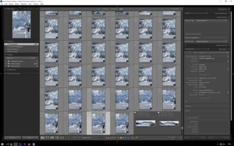
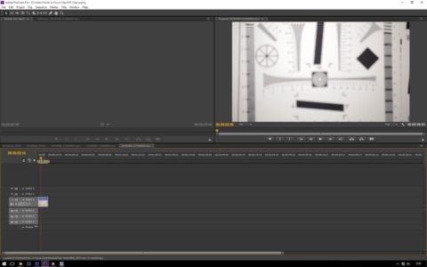
There are a huge number of places where I find Windows 10 has small but annoying edges. The biggest one for me is the way Microsoft has elected to force the UI to be dominated by white. White title and menu bars may be fine for someone who’s stuck in an office writing documents or working on a spreadsheet all day, but it becomes seriously distracting when it comes to working on photographs where you want to UI to disappear and allow you to focus on the images in question.

As you can see in the above image, the title and menu bar for Lightroom are simply obnoxious and jump out at you in a way they didn’t in the past—at least they weren’t nearly as in your face as they were in Windows 7. The same holds true for Premier Pro CS6, which also ends up with bright white title and menu bars in an otherwise subdued gray UI.

What I find so frustrating about all of this is that Microsoft really took a huge step backwards here. In previous versions of the OS the tinting and color of the title bars could be controlled. Moreover, you could dig into the actual colors of almost all of the UI elements and they could be adjusted to suit; that’s just not possible in Windows 10.
In a very real way, I find that the UI in Windows 10 has been designed to look good in a marketing piece but not necessarily be the thing that’s comfortable for day to day use. Hopefully, the folks at Stardock Systems will have a version of WindowBlinds available for Windows 10 sooner rather than later.
Unfortunately, I don’t personally have much confidence in Microsoft rectifying the problem themselves. A darker UI theme wouldn’t have been exceptionally difficult for them to produce, and its something that really should have shipped with the OS from the start. Even their feedback system, at least the last time I looked, is littered with people asking for a gray or color changeable UI.
In any event, regardless of Microsoft’s motivations, the pure white UI does pose issues in a number of the Apps I use as a photographer, namely Lightroom and Premier Pro. To mitigate the issue in Lightroom I’ve taken to running the program in Full Screen with Menu Bar mode (shift+f once). Which at least gets rid of the bulk of the in your face white.
The New Start Menu
One of the big selling points in Windows 10 is the return of a Start Menu. The Start Screen, and its full screen context switch was one of the features that grated on my seriously in Windows 8. By default, you’re no longer subject to that in Windows 10, though you can re-enable it if you want to.
It’s probably pretty obvious that my take on the whole issue is that the start screen sucked. Oddly, I don’t care for the new Start Menu either. In fact, it took me all about 2 hours to drop the $5 on StarDock’s Start 10 to replace it.
Some of the problem I have with the new Start Menu may just come down to not being really familiar with it. At the same time, it’s both bigger than it needs to be, and in many ways seems to be designed for people who don’t have thing to get done.
The right half of the new start menu is driven my Live Tiles, the same things that made up the Start Screen in Windows 8. These can display information like stock prices, sports scores, or unread message counts. Which ceratainly can be handy in some cases. However, Microsoft has also decided that this area would be at least 3 medium tiles wide. If you have less than 3 tiles worth of stuff, you end up with a lot of blank wasted space.
It’s nice that they brought the Start Menu back, it would be a lot nicer if it was more flexible so I could adapt it to my needs without waisting more screen space.
Beyond that though, in some ways I end up questioning the need and utility of the Start Menu as a whole, at least to some extent.
One of the biggest steps forward in the Windows 7 start menu, was that it provided a quick way to search for and launch a program or control panel. This is a function that I’ve always used extensively, far more so than searching through the lists of programs. It’s perhaps not to be unexpected that when I started using Spotlight in MacOS, I really took to liking the central search box as a way to start programs or make searches.
The way Spotlight positions the search box, in the middle of the screen (at least with Yosemite), puts right about where I’m already looking when I want to use it. On the other hand, the Windows Start Menu ends up putting the results off out of the way—not that this is necessarily bad, it’s perhaps just not ideal in all cases either. Moreover, it’s still more limited in functionality. With Spotlight I can hit command+shit, and type in a quick calculation and get a result, not so with the Start Menu (or at least not without having Cortana enabled and sending more information to Microsoft over the Internet).
All told, and I’ll admit maybe I’m becoming a bit of a luddite who’s afraid of change, the new Start Menu may be a step up from the Start Screen, but in a lot of ways it’s not really better than the Windows 7 start menu and it still lacks some of the features that Spotlight offers.
Little Bits Lacking Polish
The real problem I think I have with Windows 10 is the overall feeling of a lack of polish. There’s all kinds of small design decisions that make me really wonder if Microsoft is moving in the right direction.
One example of this is the lock screen. No that the lock screen is appreciably different from what existed in Windows 8, the lock screen imposes another keystroke and another little hurdle to login into the computer. Sure I can see some value in it on a mobile phone, or a tablet, and even a desktop. But the implementation certainly could be smoother.
The problem for me is that dismissing the lock screen to access the login screen and type your password now requires an extra keystroke. This may sound like a little thing, and I typically only deal with the lock screen maybe twice a day, but until I disabled the lock screen, I’d have to type my password a minimum of twice to get in. The first time, the first character was cut off dismissing the lock screen.
Big deal? Not really, but it is one little cut of frustration.
Fortunately, you can turn the Lock screen off, and simply have the login screen come up. What you can do readily is change the background of the login screen. In Windows 7 this was relatively easy, change a register value and put a <250KB JPEG in a specific folder with a specific name. Apparently now you have to patch an OS file to change the image.
The choice, an annoying lock screen with my logo or art, or a annoying login screen with Microsoft’s Windows 10 wallpaper.
Again, not a huge deal, just a little cut.
The lack of polish and odd choices continues into a number of other areas. Windows 10 uses the same volume indicator as Windows 8 did—or so it seems. This is a big change from the one in Windows 7 which is small and towards the bottom right corner of the screen. Instead there’s a lot of useless margins in the one for windows 8, and the wasted space and positioning in my primary field of view bugs the crap out of me.
And honestly, I could keep going on. While I certainly recognize that many of these complains sound petty, and many of them very much are minor issues that are highly grounded in my own reaction to serious change. The problem, for me at least, ends up being that eventually all the little annoyances become one big annoyance that gets me to want to get away from the system.
Minor Bugs
One thing that I have been pleasantly surprised about is that I have run into many huge bugs. Though I have run into couple of minor ones.
The first minor bug I ran into was the start menu not rendering right after I upgraded. This apparently was a big enough problem that I found a fix for it quite quickly on the internet. Apparently it has something to do with either my profile not being populated with the default apps or the computer not having them installed at all. It also seems to be something that’s triggered in part by upgrading from Windows 7 instead of Windows 8.
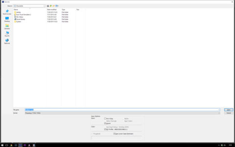
The other bug I’ve run into has to do with Photoshop CS6. I cannot resize the open and save dialogs to be smaller, they’ll grow but not shrink.

Fortunately this isn’t system breaking. The dialog may be big but it doesn’t seem like it will expand past the limits of the screen, so at least it’s not system breaking.
But this is yet again another example of where I end up feeling as though I have no real options. I’m almost positive Adobe’s response will be to tell me to upgrade to Creative Cloud—of course they won’t waive the monthly fees for me indefinitely so it’s real easy to say that when you’re the one being paid and not the one paying. And I’m pretty sure that Microsoft will point the figure at Adobe and say it’s their problem. Which leaves me with full screen open and save dialogs in Photoshop which is slightly annoying.
Photoshop CS6 is also the only app so far that I’ve found exhibits this behavior.
That said, given that I did an in place upgrade from Windows 7 to Windows 10 skipping 2 whole versions of the OS, I’m quite surprised by the lack of problems that I encountered.
Privacy
There’s an old saying, that if you didn’t pay for the product or service then you’re not the customer but the product. There’s a certain level where this is very true of Windows 10. It’s the first Microsoft OS where advertising is delivered to your by the OS, or at least can be. There’s also a load of personal data that can end up being shared with Microsoft if you take advantage of many of the new features.
In many ways I have a real problem with the situation Microsoft has created. Since Windows is the OS it has complete and total access to anything and everything on your computer. This is a situation that, for me at least, necessitates having a lot of trust in the OS vendor, Microsoft, that they’re not going to do or create paths that compromise my information or security.
On the other hand, Microsoft undermines that whole trust thing, by both having as many potential privacy invading features as there are, while simultaneously not providing an easy central way to disable them (or in some cases disable them completely) or providing complete and total disclosure of what exactly is collected.
A perfect example of this is that there’s an ongoing discussion by privacy advocates that are talking about Windows being able to report every keystroke and document content back to Microsoft. On one hand, I find it rather insane that Microsoft would actually create a feature that does this—never mind the bit where it almost certainly runs afoul of computer hacking regulations (you cannot . On the other hand, they have publicly stated that they’ve added a lot of telemetry features to help them figure out what features to add and develop. Never mind the service agreement, strongly suggests that you do give Microsoft permission to collect your passwords and so on.
I would point out on this note, that granting such permission of course runs completely contrary to the user agreements for virtually all online services at this point. In effect, if you go by a strict reading of the EULAs, you could very easily argue that using Windows 10 and granting MS the rights they claim you do in the EULA violates the EULA for say Facebook and would allow Facebook to close your account. Yea, someone didn’t think all of this through, or it’s not quite what people are making it out to be.
Conclusions
In any event, while I’m not convinced that Microsoft is acting as nefariously as many privacy advocates are willing to believe, the whole situation leaves a real bad taste in my mouth. I can fully sympathize and understand some of Microsoft’s perspective, the litigious nature of America and the world these days can very quickly lead a company to write a service agreement that asks for sweeping rights in an effort to protect themselves. Moreover, I can understand that Microsoft wants telemetry data to improve the product. At the same time, they don’t fully explain exactly what is being gathered and recorded, or give users (except those with enterprise edition versions) the ability to complete turn off those functions. And, well that’s really not something I find myself thrilled about.
The problem, as I see it though is what can I do about all of this. I could roll back to Windows 7. But Windows 7 is already out of mainstream support, and extended support will end in 2020. That does buy some time for Microsoft to rectify problems and address the privacy concerns—though at least in the latter case I’m not convinced they will short of a major lawsuit, which in turn their EULA makes a challenging matter.
Of course there’s certainly plenty of people out there who will argue that you could just not use Windows. And I could almost get behind that if there was an actual alternative OS. Like I said, I can roll back to Windows 7, but that only delays the end game. I could switch to Mac OS, but Apple doesn’t yet sell a license for Mac OS on non Apple hardware, and Apple hardware doesn’t really fit my use case. Linux is flat out, it’s virtually impossible to be a photographer and use Linux as it lacks support for pretty much every piece of software you need to be functional.
To be completely honest, I’ve never felt as trapped and helpless when it comes to computers as I do now. Between Adobe’s pay indefinitely Creative Cloud and Microsoft’s potentially invasive OS, it’s very hard to
On one hand, I can’t say I hate Windows 10 or that it’s a horrible OS that nobody in their right mind should ever consider. Moreover, Microsoft or other 3rd parties, will almost certainly end up addressing many of my complaints.
On the other hand, the white window borders alone are enough of an annoyance that I can’t recommend Windows 10 as an upgrade right yet.
Comments
There are no comments on this article yet. Why don't you start the discussion?