My Frustrations with Computers as a Medium for Sharing Photography
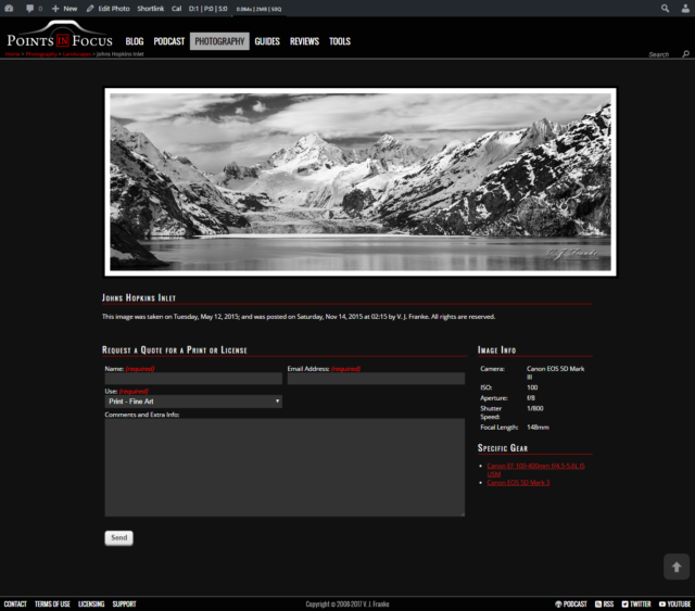
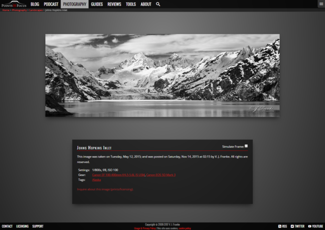
Over the last weeks of 2016, I’ve been working on a lot of behind the scenes upgrades to my site here. About half of those change have been behind the scenes tweaks and improvements that make things more efficient. The other half has been a bit of an overhaul of the theme, layout, and front end.
While I could go on to great lengths about the ins and outs of the design change and the code behind the scenes, that’s not really the purpose here. Instead, I want to talk about one specific area, displaying images on a computer, or rather how I’m increasingly finding computers a poor way to display images.
For a while now, my gallery has been somewhat unloved, and I’ve not been especially happy with it’s presentation either. One of my objectives, though I didn’t know it when I started, with this update cycle was to do something about the gallery to make it more appealing to me.

As a photographer, there’s a whole slew of problems that come up when it comes to displaying images on line. A lot of them are things I have no control over; like people with really badly calibrated displays.
Some end up being socially driven issues. It doesn’t take very long to find a discussion about piracy on line where someone says, “If you don’t want it stolen, don’t put it online.” On the subject of piracy, there’s room for more than one post talking about the problem and its impact — but that’s not my point here.
The trick, issue?, trouble?, for me as a photographer and as the person designing my website, is trying to balance the competing points of not giving away the farm, so to speak, and presenting my images in a way that closest reflects how I intend them to be seen.
In the past, I’ve done some research into various mechanisms for discouraging people from copying images wholesale. The conclusion I came to was that the least intrusive and most effective mechanism was simply not to post large images — along with accepting that there always will be people who copy the images anyway.
The thing is, small images suck too. And this is something I find increasingly frustrating when more and more I’m designing my images with the intent to print them fairly large.
Fundamentally, there are two problems here, an artistic one and a visual/technical one.
Let me start with the artistic problem.
When I’m making my images one of the things I’m always thinking about is how that image is going to ultimately be presented. If I’m shooting a product shot for a review, I know that it’s going to be a small image on a website, and as such I need to make sure that it’s clear what that image is supposed to illustrate.
On the other hand, when it comes to my finer art images (landscapes, wildlife, etc.) my intent is for them to be large prints. At a minimum I’m thinking A3+ (13 x 19 inch / 328 x 483 mm), but increasingly I’m thinking about 24 x 36 inch ( 610 x 915 mm ) or even bigger, say 30 x 80 inch (762 x 2000 mm) panos.
Simply put, artistically small images don’t reflect my vision for the picture and how I want people to experience it. Worse, even if I completely ignore the potential problems with piracy, screens, especially tablets and phones are only so big, and they’re not nearly as big as the print.
The other part of the problem is technical.
Half of it is dealing with image sizes, vision, resolution, bandwidth and so forth. The other half, and quite possibly the harder half, is dealing with the HTML to make this all look reasonable on various different devices. This of course, is one of those other problems that I created for myself with this years major overhaul. In the past, I never really paid much concern to phones and tablets. After all, pictures are big, and that doesn’t work well on tiny phone screens.
This round of updates, I spent more time than I ever have in trying to make sure that the site responded well to mobile devices. There are still a lot of sticking places where small screens just don’t work well. But by and large, the site now renders in a way a phone or tablet user can at least read and interact with it.
Of course this introduces a dilemma for the pictures in the gallery; what looks and works well on a big screen, doesn’t on a small one.
The one thing I do feel I had going for me is that I wanted less clutter and cruft on the image pages. I wanted the image to be front and center with not a whole lot going on around it. That significantly simplified the coding involved.

In the end, with all the work done, my problem really hasn’t changed. Sure, I think the images gallery pages are cleaner, and put more focus on the images. Moreover, the images are generally larger than they have been in the past. In fact, they’re as large as I feel I can make them without creating a situation where you have to scroll to see all of it or I’m wasting bandwidth serving an image that’s big but gets scaled down.
But the biggest take away I’ve made from this whole thing though, is that computers, tables, and phones, still suck when it comes to showing off photography, especially when the images are being designed to be big prints.
Comments
There are no comments on this article yet. Why don't you start the discussion?