Pop Corn Poster: Designing the Image

My mom is in the slow process of redecorating her movie room; she’s decided she wants to hang “snack bar” posters reminiscent of what you might expect at an old time theater snack bar. What that means, as both photographer and son, the task more or less ends up to me to design and create the images. Not that I mind.
The concept I was presented with was to have a series of images of various foods, pop corn, soda, candy, that are styled as snack bar ads. Following that I’m envisioning capturing the elements that most evoke. Each image will carry a theme and color-scheme complementary to both the overall theme and the subject in each image.
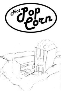
I’m starting with the pop-corn poster, which I envision will look like the concept sketch to the right (no, drawing isn’t my strong suit). The subject matter is dominated by yellows, reds and white, so I’m thinking I’ll work with that color pallet for the image I’ll complement and accentuate the red stripes on the popcorn containers with a red background. Tint my main light to warm up the yellows in the popcorn. I think, red and yellow will also work well as popcorn is suppose to be warm and buttery (also yellow) and red and yellow carry that connotation as well.
I’ve broken the image into it’s 3 key layers. For the foreground, I’m thinking out of focus popcorn to frame the main scene and evoke a bit of the feel of a popcorn machine. The main scene will be two popcorn cartons overflowing in a sea of popcorn. Finely the background will be a nice red gradient falling off as it progresses away from the scene.
I’m expecting the real challenge to be lighting this. I’ll be working with only 2 speedlites and not much to go by in the way of proper light modifiers. My overall goals are to provide even lighting without any harsh shadows, while dealing with any spill not having a proper softbox will create.

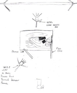
The background will be lit by a 430Ex on a light stand directly behind the scene. It will be gelled red and probably zoomed to 70mm give or take. If everything is centered right, it should give me a nice symmetrical falloff on the background giving me darker corners. Which is what I’m looking for.
The main light will be my 580Ex pulling double duty, being triggered by a pocket wizard and triggering (by way of master mode) the 430 ex slave. I’m thinking I should probably gel it between half and quarter CTO to warm up the popcorn and cartons. I’m expecting it to be slightly to camera left, and above the camera shooting though a diffusion screen. That should take care of most of the shadow issues. The rest, if necessary, will be taken care of by large fill cards on either side of the scene.
Of course the technical challenges are only compounded by the budget, of which there is none to speak of. I suspect I’ll be pulling some serious Strobist style hackery to get what needs to be done, done. Who knows maybe something creative and useful will come out of solving problems as the come up.