Canon’s Camera UIs, No Card2 in Camera
Some people are probably thinking that I’m picking nits here, but I’ve just about reached wits end with misreading the format card screen on my dual card bodies and scaring the crap out of myself. Below you see the the format card screen form a Canon EOS 5D mark 3.
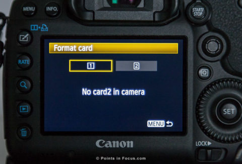
As the display states, there’s no card 2 in the camera. However, while the UI is accurate it’s just not a good design. Three issues leap out at me.
The first problem is the lack of a space between the word “card” and number “2” in “card2”. If you’re going quickly it’s very easy to simply not see the 2 and read the statement as “no card in camera”.
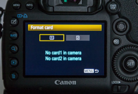
Tangentially the whole situation is inconsistent. When there is no card in the camera, “No card in camera” is displayed everywhere else, except the format screen. The format screen on the other hand, displays the same line repeated with card1 and card2, like the illustration shown below.
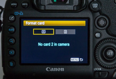
A simple step to improve the UI would be to add a space between the 1 and 2. It doesn’t make it any easier to understand what card is and isn’t in the camera, but at least it makes it a bit harder to misread “card1” or “card2” as just card. It’s not hard to see the difference in readability between the illustration below and the photo at the start.
Since I’m suggesting change, though, why stop there. The second failing is that you can’t quickly tell what card 1 and card 2 actually are unless you memorize it. I’ve been shooting dual card Canon cameras for years now, and while I can tell you which is which when I’m sitting here writing an article (and can verify it) when I’m on a shoot and I end up in the format screen (which is usually a sign of something having gone wrong to start with), that easy recall goes out the window.
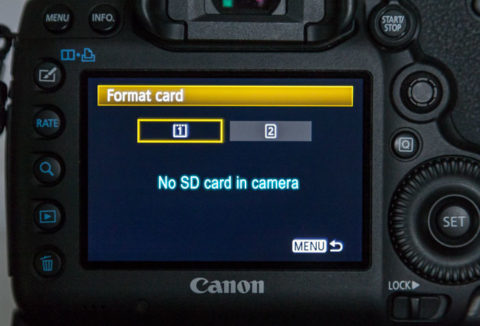
There’s no misunderstanding what card is and isn’t in the camera; and it’s also a lot harder to ignore the SD or CF designation and simply read it as “No card in camera”.
Though I think it can be taken further. Since the introduction of the Digic 4 CPU and higher resolution 390PPI displays Canon’s camera’s have had the graphical power to draw cleaner icons and more sophisticated displays. Moreover, icons and imagery are far better at conveying information than text, especially if used well.
The “grayed out” card 2 in all the images so far, might lead one to believe that card two wasn’t in the camera, simply by being grayed out. Unfortunately, Canon failed there as well, as that’s merely what the unselected indication is. In fact they convey nothing but the selected card for formating via those two icons. What is and isn’t available is conveyed only by the text message alone.
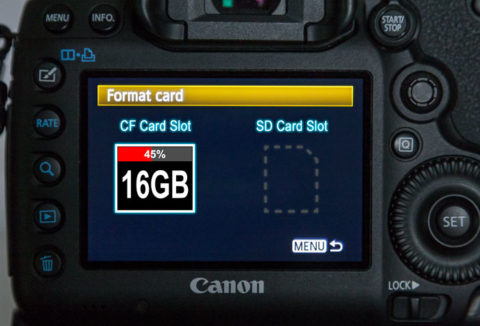
It’s immediately obvious to me, at least, what’s is and isn’t going on here. I know, for example, that there’s no SD card in the camera. There’s no need to spell it out, the dashed outline and lack of information conveys that perfectly. I know clearly which card is selected, it’s outlined in bright white. instead of gray. I know what kind of card each card is as well, not just from the labels, but also from the shape of the card.
Further, unlike Canon’s screen I’ve added a capacity label and usage indicator. Though they’re obviously not strictly necessary, since I can convey the information it seems useful to do so. In Canon’s case, they convey it when you select the card in approximately the same way.
It would be arrogant of me to suggest that my mock-up, which I really just wiped together, is perfect. But I think it does a much better job of conveying information in an easier to understand way without the potential for misreading things when under pressure.
Comments
There are no comments on this article yet. Why don't you start the discussion?