Lightroom 8 Years Later – Asset Management and the Library Module
The Library module is easily the core of Lightroom’s asset management functionality, and as a side effect of that very much the core of Lightroom as a whole. In this part of Lightroom 8 Years Later, I’m going to look at the Library module in mode detail.
The big picture aspect of the Library module is that it’s a thumbnail and image viewer with supporting aspects for importing, exporting (though it’s not limited to the library alone), and managing the images that are in your collection. Over Lightroom’s history, the Library module has remained mostly unchanged. There certainly have been some refinements and improvements, but the organization and features hasn’t radically changed.
Back in part two I wrote about Lightroom’s user interface, specifically the penalized organization and structure. The Library module, like all Lightroom modules, uses that system at least as best as it reasonably can.
Library Overview
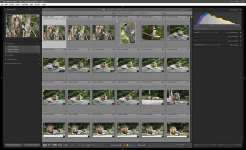
In the Library module, the left panel primarily contains navigational elements that allow you to get around your catalog’s images. Specifically these are the Folder List, the Collections list, and the Publish service list. All of these collections are presented as hierarchal trees where child nodes (folders, or collection sets) can be expanded to show further children.

These are all pretty standard navigation aids for traversing a hierarchically organized system; be that file system folders, or nested collections in collection sets, or the collections that are part of various publish services. The latter, publish services, Lightroom treats very much like a special kind of collection set.
The right panel in the Library module is dedicated to manipulating the metadata of the selected image or images. This includes a quick develop tool, keyboarding, and more specific IPTC and EXIF metadata editing and viewing.
Incidentally this kind of left to right mapping of general to more specific or start to finish is a general style in the Lightroom UI. And that consistency is reasonably useful.
The main section of Library module consists of image viewer. In the Library, there are several options for how Lightroom can display your images. These are; a thumbnail grid, a single image “loupe” view, a multi-image survey view, and a dual image x/y comparison view.
For the most part all of this functionality was available in the first versions of Lightroom, and haven’t really changed. And for the most part, there aren’t really any such great deficiencies that the Library as a image navigation and management tool is fundamentally crippled by the design.
That said, many of the details, such as the import system or the Keywording system, also haven’t fundamentally been overhauled, and often to their detriment.
Importing and the Import Dialog
Since Lightroom doesn’t just open and mess with images willy-nilly, it needs some mechanism to know what images it should track and deal with. A natural extension of this is also clearly the ability to copy images off a flash card to local storage as well. For Lightroom this is all handled by the Import dialog.
The import dialog is one place where Adobe’s approach of letting Lightroom’s UI languish has had some real consequences. Moreover, when they did try to revise the Import dialog in late 2015, they did so in what can best be described as a clueless heavy handed fashion. I wrote about the new import dialog when Adobe introduced it with mixed feelings — and my response was quite possibly the most moderate of any I’ve seen published.

A large part of the problem with the new import dialog Adobe tested, and then quickly retracted, was that Adobe appeared to be under the impression that many Lightroom users would be accepting of dumbing down something as critical as the import processes. This is demonstrably not the case, and is very much contrary to what actually needs to be done in the import dialog.
At the same time, the late 2015 attempt at a updated Import dialog did underscore some of the problems with the Import dialog as I see them.
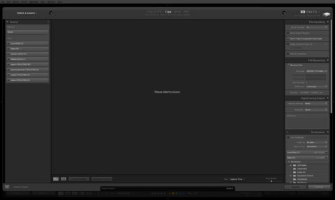
As a whole, Adobe follows the same left-to-right source-to-destination pattern in the import dialog that they have in the rest of Lightroom. The left most column is the list where you select the source of the images you want to import. The center of the dialog shows you thumbnails or a loupe view of the images that are in the source folder. Finally the right most column allows you to specify how the images should be tagged, manipulated, grouped, and where they should be stored on your computer.
As a whole, that organizational strategy is not a bad one. The problems with the Import dialog stem from a lack of attention to details.
One of the biggest oversizes that Adobe made goes back to their decision to add support for video files back in Lightroom 4. In fact, the whole video support is amazingly half backed as a whole — I’ll come back to this when I talk about exporting later.
When Adobe added support for video files, they simply expanded the filter set for supported file types that should be imported. Instead of just allowing raws, jpegs, tiffs, and a couple others, they also added the most common container formats for video (mov and mp4).
That was nice, and necessary to get video files into Lightroom, but that wasn’t all that needed to be done — it was merely all Adobe would do. They also needed to add options to deal with the video files more precisely as well. And a lot of this comes down to the half baked rest of the video support too.
The two points I feel are especially important are; first, the ability to filter the import by file type (e.g. video, stills, or both), and the second is the ability to store stills and video files in separate places.
I won’t say that these features are absolutely critical, but they would go a long way towards improving the incomplete video support that exists.
As for why I think these are necessary, the answer is simply that not everyone is going to treat video and stills the same way as a photojournalist. Moreover, video files are considerably bigger, and there’s considerably less that can be done with them in Lightroom, compared to stills.
Of course, a lot of this will of course come down to what exactly you’re shooting and why. In my regular travels shooting wildlife and landscapes, I frequently will find interesting behavior that is best documented in a video clip instead of stills. These clips aren’t part of a dramatic work so completely separating them from my library makes little sense to me. At the same time, there’s also a good chance that they’ll end up in some kind of edited work too, which makes separating them from the regular images handy. Moreover, video files are quite large compared to stills as such I frequently want to store them on a different disks than the rest of my Lightroom library.
In any event, even if I don’t want to mess with video at all in Lightroom, there’s no easy way to exclude it from the import process if it’s on the card. And quite frankly this is a poor solution given that it would not be difficult to filter video from stills just as Adobe filters new images from duplicates.
The other major usability issue I want to talk about in the settings dialog is the way the actual settings are presented. This is on place where I think the late–2015 “new” dialog did something right.
In the standard import dialog, there’s no way to hide the source list (left side) or the destination and attributes (right side). For many users, at least in my experience, most of this stuff doesn’t change from import to import, and doesn’t need to be prominently displayed all the time. Instead being able to hide or collapse those panels frees up more room to display the thumbnails that will be imported.
Beyond that, I’ve run into some real usability issues with the import dialog’s save to selection area and less computer savvy users. Specifically I’ve fielded a couple of cases where people have miss-clicked on a folder in the list which trying to click import in a hurry. Given their proximity, this is neither all that difficult to do either. They then end up importing their images into a folder that’s outside of their regular folder structure and then have trouble finding their images later on in the catalog.
On the other hand, the folder list is not something that generally needs to be changed every time you import files. Though I wouldn’t recommend removing it, as well there are certainly times where it is necessary or desirable to import things to a different location (e.g. when working on multiple external drives on a laptop). However, at the same time, it doesn’t need to be prominently located on main screen all the time either.
That about wraps up the import dialog, which bring us to the general process of dealing with the imported images and adding metadata to them.
Editing Image
Obviously everybody’s workflow is going to be a little different, but for me, and I suspect the vast majority of Lightroom users, the next step they’ll undertake in the Library module is what I would call editing. Specifically, I’m talking about the process of sorting through your images to find the ones that the keepers, the ones that are the rejects that need to be deleted and so forth.
Lightroom provides users a number of tools to use to edit and refine their images and most of them work pretty well. Or at least, I can’t find any real objections to them. Moreover, there’s a whole slew of ways to go about this, and honestly that’s a good thing given that people will obviously approach the process differently.
Lightroom provides users 3 main ways of marking their mages in the editing process; flags (pick, reject, and not flagged), stars (0 through 5 stars), and color labels (red, yell, green, blue, and purple). Additionally, these marking systems can be tagged on the fly using keyboard shortcuts. For example, ‘x’ flags a picture as a reject, ‘u’ un-flags a picture, and ‘p’ flags a picture as a pick. (Stars are assigned with 0 through 5, and color labels 6 through 9.) In addition holding shift, or turning on caps lock will advance the selection box to the next image after the flag or label has been applied.
Beyond the marking systems, Lightroom has the previously mentioned survey view and the x/y comparison view.
All told, Lightroom does a good job dealing with the editing use case. In fact, I really don’t see any obvious points where it really needs improvement in this respect. If anything, the biggest improvements to one’s editing workflow would probably come from a vastly bigger monitor and the extra screen real-estate that comes from that — used for either bigger thumbnails or more thumbnails on the screen at a time.
Metadata, Keywords, and the Map Module
The final big use case for the Library module is adding and editing metadata. I’m also including the map module in this discussion, as its sole purpose is to add and display GPS track data which, for all practical intents and purposes, is just more metadata.
Metadata
So lets start with the goods. Adobe made Lightroom’s UI flexible enough that the metadata entry box — the lowest box on the right panel — can be reconfigured with either a plugin or through the now deprecated metadata field list files.
I have to say, that while Adobe has deprecated the metadata field lists, they were the more approachable of the methods that could be used to customize Lightroom. Instead of deprecating them, I would have really liked to see Adobe integrate a field list editor right into Lightroom.
Okay, so I may have to back up a hair and address why one would want to edit the metadata panel layout. The answer for me boils down to having the fields I use and care about easily accessible without a ton of added overhead. Instead of me rambling about this, I’ve published my metadata field list, feel free to download it and see what I’ve changed for yourself.
Map Module and Geotagging
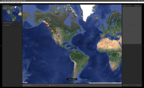
Back in version 4 Lightroom added support for geotagging and displaying the position of your images on an embedded Google map. This was done through what technically was a separate module, the Map Module, but I’m including it here for two reasons. First, the functionality on it’s own is quite limited, and second, because it logically relates to metadata and tagging images.

In any event, the map module basically offers two bits of functionality. First, images in the active folder, collection, or selection with embedded GPS data will be displayed on the map in a location that corresponds to the GPS coordinates of the image.
Adobe has provided limited “geofencing” capabilities in that you can define a point and the radius around it to be a “Saved Location” that can be quickly referenced. Unfortunately that’s about all you can do with the saved locations functionality. You can’t leverage it to automatically add IPTC information such as city, state, country, country code, or sub location.
The other major bit of functionality that is available through the GPS module is the ability to apply GPS data to you images from a separately recorded track log. Most modern stand alone GPS units, as well as a whole slew of software for smart phones can generate .gpx formatted tracklogs with coordinates being set at various time and/or distance intervals. Lightroom can then import that file and use the time stamps in the file and on your images to add estimated GPS coordinates to your images.
Using tracklogs is something I’ve never personally bothered with. Largely because every time I think, “Oh I should do a tracklog for this,” I’m already done shooting. In fact, this is generally the problem I’ve seen with not having GPS capabilities integrated into one’s camera, the overhead of getting a log, making sure the clocks are synced reasonable well, and applying it after the fact, outweigh a lot of the utility of having GPS tagged images.
Beyond those two functions, there’s not a lot going on in the map module to complain about. The only major deficiency, and this is a deficiency in ALL of the modules other than the Library, is the lack of a folder navigator to use to access your images.
Keywording
The last major area of the Library module I’m going to talk about is the keywording aspect. This is quite possibly the most broken, or at least the lest finished, part of Lightroom’s library module.
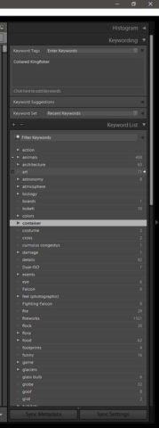
Keyword entry and management are provided through two panels on the right side-panel bar. The “Keywording” panel provides a straight forward entry mechanism for adding and removing keywords from an image. It’s mostly a large text box that you can type fairly free form keywords into. In addition to that there are two 3×3 grids of keyword suggestions and user defined keywords sets.
The second panel is the Keyword List, which is what Adobe thinks passes as a keyword manager. The keyword list shows all of your keywords in a hierarchal tree (similar to the folder and collection lists).
Let me start with the good. Keywords in Lightroom are hierarchal. You can nest, say “abacus”, inside another keyword, say “things”. The hierarchy means that you can narrow or widen your search based on how you setup your keywords. If I have for example.
- Things
- Math Instruments
- Abacus
- Calculator
- Slide rule
- Math Instruments
I can search for a specific thing (e.g. abacus), a more general set of things (e.g. math instruments), or a really general set of things (e.g. things). This simplifies finding suitable material in the face of a client’s request; “I’d like to get a large print of tropical fish,” versus, “I’m looking for an illustration of a clear lion fish.”

This is also useful as Lightroom will, by default, export all the keywords in the hierarchy. So exporting an image tagged as abacus, as shown in my above example, will also have the exported image tagged, math instruments and things. Since most image hosting services (e.g. Photo Shelter, Smugmug, etc.) will index the keywords of images, that abacus image will show up for searches of the other keywords as well.
In addition to being hierarchal, Lightroom’s keywords have self contained synonyms. I use this extensively with my wildlife images, where I’ll make the keyword the common name (e.g. bald eagle), and add the scientific name (e.g. Haliaeetus leucocephalus) as a synonym in the keyword. For all intents and purposes I’ll never see or need to address the scientific name in my workflow.
Like the parent keywords in a hierarchy, Lightroom will export the synonyms of keywords with images that are exported. So tagging an image with bald eagle, will also tag it with haliaeetus leucocephalus. While most people might not care, it does mean that someone looking for specific images of a specific subspecies (and I do get that specific when I know the subspecies) can find the images in a search using the scientific name.
Beyond just the mechanics of the keywords themselves, Lightroom provides a number of useful tools for applying them to images. The keyword sets that I mentioned previously can be applied on the fly using alt-number (1–9) based on the keywords position in the keyword in the grid relative to a numeric keypad. There’s also a keyword paint brush that can be used to apply and remove keywords by clicking on the image in the thumbnail grid.
Generally speaking most of the aspects of Lightroom’s keyword system are well implemented. The big problem ultimately is the lack of any kind of serious keyword management mechanism. Adobe’s idea of a keyword manager is the Keyword List panel. This works fine for a few 10s or maybe 100–200 keywords, but falls apart very quickly after that.
On my 24″ screens there’s only enough room for about 35–40 lines of keywords. Again, this is certainly passable but the last time I counted, and ignoring synonyms, I had nearly 1000 keywords in my keyword list. Trying to manage that is nearly untenable given the single scrolling list the is the keyword list.
Of course, there are ways to mitigate the problems, if you get ahead of them. If you know that you’re going to have a lot of keywords from the start, you can make extensive use of hierarchies to organize your keywords as you go. Of course, most of the time you don’t realize you’re going to have as many keywords as you end up with, or you over estimate your needs and end up with needlessly deep hierarchies and overly complicated categorizations.
Wrapping Things Up
Over the last 8 years, Lightroom’s library hasn’t really seen all that much in the way of change. And honestly, I’m not sure that it’s a bad thing. The vast majority of functionality that’s needed in a solid image organizer is there and has been there since the beginning.
Almost all of the systems and mechanics are generally quite flexible — at least to the extent that it’s feasible to make them. There are multiple ways to deal with editing and categorizing images, and Lightroom doesn’t strongly push anyone into any specific system. If you don’t like creating categories all the time, you can use folders.
The flags, stars, and color labels make it possible and effective to approach editing and notating images in a flexible way that works best of your.
Even the keyword system is largely mechanically sound.
The lack of change in Lightroom’s library module hasn’t been that much of a detriment. However, there are still areas where there’s room for improvement. The Import dialog can certainly be improved, especially with the addition of video support to Lightroom and the potential desire to not want to import video or store video in a separate place than with ones images.
Additionally Lightroom really needs a proper fully fledged keyword manager at this point. For those of us that have been accruing keywords since Lightroom 1, or 2, our keyword lists have grown to the point that effectively managing them is closing on being an untenable situation.
So with that said, that wraps up this entry in my series on Lightroom 8 Years Later.
Comments
Import Module. Needs lots of usability enhancements.
1. Allow filter selection by File Types.
Reason. I may only want to import raw or jpg. Currently I have to import everything, use the search fields to isolate the filetype of my choice and then delete. In the mean time Lr is creating previews and updating xml data for lots of files which I am in the process of deleting. A pain to perform and a double whammy on Lr performance.
2. Allow filter selection to import by Capture Date.
Reason. Most often cause is that my card may have multiple projects and date provides a good means to isolate specific projects.
3. Import Preset.
The Import Preset is on the bottom panel of the Import screen, instead of on the right hand panel. I wager that many people are not aware of this really useful Preset option. I have 2 main presets a) For my own images where I have my Metadata Preset and Develop Preset. and b) for other peoples images (ie. where I print or post process other photographer images) where I definitely do not want to apply my metadata or develop settings.
Library Module.
If I am reviewing /editing an image within a large folder of images (say 500) and then need to check an image in another folder, when I return to my active folder I have to start searching for the image I was last working on from the start. What a waste of time.
@Matt O’brien,
See, this is the kind of thing that drives me up a wall every time I come back to working on this. There’s so much stupid in Lightroom, and there’s so much that Adobe just plain doesn’t care about addressing or improving, which is kind of something I’m trying to draw some attention to.
Of course, between Creative Cloud subscriptions and the lack of any real competition, I just don’t see Adobe caring.