Canon EOS 5D mark III Review
LCD Display
The 5D mark III uses the same 1.04 million dot 3.2” diagonal LCD display that the EOS-1D X uses. The pixel pitch isn’t appreciably different from that of the 920,000 dot 3” display on the 5D mark II and 7D, but the screen is slightly larger.
The screen is coated with Canon’s Clear View II technology, which utilizes sophisticated anti-reflective coatings to improve contrast. I’ve yet to find a situation where the screen lacks brightness or is to glairy to be used in the daylight. Though a beach, or probably a snow covered landscape, would be pushing the limits of that.
The screen was one of the most outwardly impressive parts of using the camera when I first got it. Of course, I was coming from the 230,000 dot LCDs of the EOS-1D mark III and 40D not the 920,000 dot LCDs of more modern Canon bodies. However, it’s quite noticeable the level of clarity in the screen compared to the low resolution predecessors.
One feature the 5D mark III’s LCD does lack is articulation. I’m sure many would argue that articulated screens don’t have any place on pro level SLRs. However, I would contend that with Canon’s focus on video an articulated LCD can be the difference between a very solid camera body and one that requires yet another expensive add-on, namely a separate monitor, to be really useful.
The biggest frustration I’ve found with the new LCD is the polarization. All LCD screens must be polarized to work, it’s fundamental to the crystal’s ability to obstruct the light. Moreover, as anybody who’s ever played with 2 polarizers knows, when you align them right you can’t see through them.
In the past, probably by pure luck, the polarization on Canon’s rear LCDs has worked well with polarized sunglasses, allowing me to see the screen when the camera is held normally. With the 5D mark III, this is no longer the case. The current polarization appears to be rotated 90° to the old way Canon polarized screens. Now admittedly this may not be a problem for every kind of polarized sunglass, and you can certainly use non-polarized sunglasses too—which is what I do now—but it is frustrating when things like my iPhone simply exhibit a color cast when rotated instead of becoming invisible.
Menus and Settings
The menu and setting system in the 5D mark III build on the tried and true design of Canon’s menus reaching back as far as I can remember in their DSRLs. All of the camera settings are organized into 4 general categories; shooting (red), playback (blue), setup (yellow), and the new AF (purple) menus. Additionally there is a user customizable My Menu (green) which allows quick access to settings you commonly use.
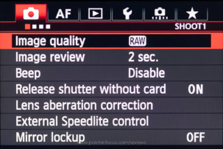
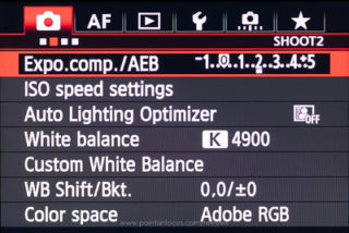
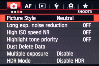
Overall Canon seems uses a wide rather than tall menu organization. Buy this I mean none of the menus scroll to contain more than 6 items. Instead, if there are more than 6 options that fall in the grouping, another logical page is created to contain them. For example, in the 5D mark III there are 5 pages under the AF menu. In the past, this was indicated by multiple tab icons at the top of the display. As shown in the EOS-1D mark III menu image below.
|
Shoot Menus in Still Photography Mode |
|
|---|---|
 |
 |
 |
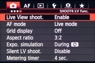 |
The 5D mark III, however, has added so many menus now that it’s not possible or practical to have a separate tab for each page. Now there are 5 top-level icons indicating the menu type and just below that a status bar with a graphical representation of which page you’re on and a title line indicating what menu page you’re on.
The menus can be navigated using the multi-controller, or the scroll wheels. When using the scroll wheels, the secondary (rear) dial moves the cursor up and down, while the main dial (top) moves from menu page to menu page. Additionally pressing the [Q] button will jump quickly to the next section.
There is something to be said about the discoverability of the non-scrolling menus. You can clearly see that there are more settings because there’s clearly another page. Unfortunately, the flat design runs into limits when the number of pages increases to the point that there isn’t enough room for separate tabs. At this point, the small page icons along the top of the menu isn’t any more discoverable than the a vertically scrolling menu is, and may in fact be less so as scroll bars are a common item on virtually all computers at this point.
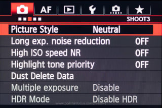
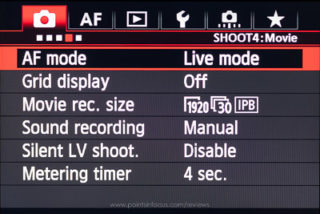
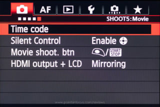
Canon’s menus have one other usability quirk that I find mildly frustrating, Canon will hide menus that they don’t feel apply to the camera’s mode of operation. There’s a trend, not only in user interface design, but in general, it seems, to hide things that might complicate a user’s experience under the guise that you might intimidate the novice user. Personally, I disagree with this, as I find hiding things both makes the experience frustrating and confusing when trying to help someone and annoying when trying to change or check a setting that is hidden for some reason.
| Shoot Menus in Movie Mode | |
|---|---|
 |
 |
 |
 |
 |
|
On the 5D mark III this nonsense shows up in two places. First, when the camera is set to the green box creative auto mode—a mode I would also argue has no place on this class of camera—the camera hides the majority of menus and menu settings.
Secondly, and this is more frustrating to me as an advanced user, is the contents of the shooting 4 menu and all of the shooting 5 menu are hidden or displayed depending on whether the camera is in video mode or not. Simply wanting to check the movie recording size, compression mode, or the time code, requires a cycle of the mirror and shutter for the camera to go into movie mode and back.
The most annoying aspect of the hidden/disabled menu behavior for me personally comes to the way the My Menu interacts with the disabled/hidden menu items.
Canon added the My Menu with the 40D as a way to allow users to put frequently used items on a menu that would be only a click away. However, like all the other menus, the My Menu carries the same 6-entry limit, one of which is taken up by the “My Menu Settings” entry, leaving 5 slots available to a user.
When the camera is in normal operation, the two disabled video entries in my My Menu eat up precious space that I could really use for still photography options that don’t apply to video. Likewise, when shooting video I can’t really dedicate any more space in my My Menu for video stuff as that would displace the still photography entries.
If Canon wants to continue with the hidden features approach, which I still disagree with, they could at least provide us with 2 My Menu’s, one for when the camera is in Still/Live view mode, and one when the camera is in video mode. Alternatively, they could add a couple of more slots, even if it required scrolling, to the My Menu to address the disparity between video and still photography needs.
While I’m talking about the My Menu, there’s one other point that I would bring up, formatting memory cards. Nikon has a nice feature where cards can be formatted by holding down the Mode and Trash buttons simultaneously as a shortcut to going through the menus.
While formatting isn’t perhaps the most frequent operation I use, I do use it almost every day I’m shooting. As a result, format card occupies one of my precious My Menu entries. If there was a 2-button combination that could be used to trigger a card format (say by holding the Trash and backlight buttons) that would be not only slightly faster and more efficient when I do need to format, but it would free up one of those precious my menu slots.
Comments
There are no comments on this article yet. Why don't you start the discussion?