11″ iPad Pro (2018) A Photographer's Perspective
Over the last 25 years, photography has moved from the dark room to the computer. That move enabled new ways of working that photographer’s in the past could have only dreamed about. Moreover, as computing power continues to advice, it continues to enable even more possibilities.
This is the story of the future of those possibilities. A future that’s tantalizingly close yet still so far away.
Unlike any previous iPad, the 2018 iPad Pros exemplify the potential of compact computing. The iPad Pro’s A12X CPU is a monster by tablet standards, and in many ways is more comparable to what’s used in laptops and even some desktops. However, as good as the CPU is, it does little more than dramatically underscore the limitations imposed by Apple’s iOS.
My biggest take away from the 2018 iPad Pro isn’t how amazing it is, but how much Apple’s management and/or designers continue to hamstringing it to make it fit what a tablet is perceived to be. For me, this is a story of frustration.
Background and Perspective
In many ways, photography is about control. One aspect of that happens on the capture side, where the photographer controls exposure, distortion, and composition to make an image. However, the other half of that happens back in the office. Where serious photographers exert their control over the way the final image is shaped.
The Ansel Adams’s of the world knew, and still know, that what you record with the film, or now the digital sensor, isn’t the end of the story. It’s merely the start.
Until recently, this second half of the process was locked away from many photographers. There are some costs associated with the materials and tools. And of course, just like it does today, it took time to master the craft. However, in many ways the real killer, and the real cost, of all of this was the darkroom. Not only did you need to buy the tools, but you needed a large enough space to be able to use them.
The move to digital cameras did, as technology often does, democratizes the process. No longer did you need a physical darkroom, but you could get instantaneous feedback on your work.
An entire darkroom, could be compressed into a box no bigger than a few cubic feet.
As computers have continued to advance, they’ve made it possible to continue to compress the power into smaller and smaller packages. By the early 2010s, advanced in semiconductor manufacturing and CPU design, had enabled us to compress the needed power into a laptop instead of a desktop.
The entire photographic process became portable.
Now we stand on the precipice of compressing things down yet again; from laptops to tablets.
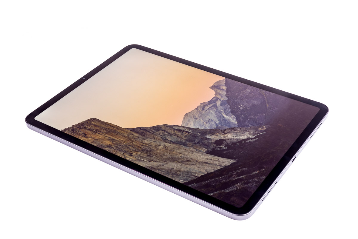
In 25 years, the serious photographer has gone from needing a room full of equipment, to being on the verge of being able to do the same creative work on a tablet in their tent at base camp.
It’s through this lens that I’m looking at the iPad Pro. As a photographer who’s seen the darkroom become the laptop, and now potentially the tablet.
iPad Pro Performance: The A12X
Every generation of Apple’s A-series CPUs has brought better performance with it, and the 2018 iPad Pro’s A12X is no exception. The A12X is posting benchmark scores on par with top end laptop CPUs from a few years ago. This includes, the Intel i7-4890HQ that’s in my venerable MacBook Pro.
On one hand, that’s quite an impressive feat. Sure, the i7-4890HQ is a 5 year old CPU, but it wasn’t that long ago that Apple’s A-series CPUs were barely able to keep up with the slowest of Intel’s CPUs.
The i7-4890HQ’s performance is an important threshold to me. It’s comparable to the performance of my mid-2014 15″ MacBook Pro.
Sure I could get a faster computer, but I can’t say I’m hard pressed for one. While it’s no longer the fastest thing on the market, that venerable old MacBook Pro is more than adequate for my workloads. Or perhaps a better way of putting it, is while I can do many things faster on my more powerful desktop, I don’t feel like pulling my hair out when I’m sitting in a hotel trying to edit a days worth of images.
The A12X’s performance changes the fundamental reasoning behind what you should be able to do with a tablet.
Ultimately for me, performance is not something that’s as simple as I need more of it. The way I see it, there’s two possible paths that one can choose to walk down. One path is to get more performance for the same weight and power usage. This is certainly not hard, I could upgrade my MacBook Pro to the current gen ones with their 6-core CPUs.
However, there’s another option. Instead of keeping the power consumption equal, the efficiencies gains from new manufacturing processes can be plowed into lowering the power consumption while holding the performance steady.
It’s this latter option that I’m interested in. Moreover, it’s very much what the A12X potentially can provide. However, this is where the iPad Pro runs in to problems.
More compute performance is only valuable when I can bring it bear on solving my problems. Ultimately, this is why I find it very hard to care about the performance gains Apple made in the A12X. There’s no good way for me to use it.
Right now, the iPad Pro is a lot like having Honda Civic with a 1000 HP engine and stock tires. The big engine sounds great on paper, but tiny tires that can’t get the power to the road.
For what I can actually do on an iPad, my new iPad Pro isn’t obviously better than my old Air 2.
All things being equal, putting up nearly equal benchmark scores should mean that I ought to be able to do the same kinds of computational work with the two CPUs. Of course, all things aren’t equal, and that’s the problem.
Without being able to bring that performance to bear on my workloads, there’s much less value for me in the A12X’s performance. In fact, Apple has the same problem that has plagued Intel for the last 10 years. In the tasks I can actually do on an iPad, my new iPad Pro isn’t obviously better than my old Air 2.
Another part of the iPad Pro’s problems are its memory configuration.
System RAM becomes important when dealing with large datasets, such as stitching large panos. All but two modeless of the of 2018 iPad Pros come with only 4 GB of RAM. Only the 1 TB storage model has 6 GB.
Historically, limited RAM in tablets hasn’t been a real problem. However, a lot of that comes from the limitations of past mobile CPUs and their focus on power efficiency not performance. This in turn influenced app design to focus on lighter weight, less featured, and less demanding software. After all, there’s no point in writing a massive data-hungry number crunching app, when the CPU would take forever to do anything with it.
However, the A12X changes that fundamental reasoning.
We’re no longer talking about a CPU that can only do low-performance workloads. Given the capabilities of the A12X, it’s practical to run much more compute intensive workloads. In fact, it should be practical to run the same workloads as I run on my MacBook Pro. However, for those more complex tasks, the limited RAM becomes a problem.
One of my regular big computationally intensive workloads is stitching 200+ MP panos from raw files. This can easily consume 20-24 GB of RAM. With only 4 GB, the lack of available memory would likely nullify most of the A12X’s performance. Instead of doing work, the CPU will be sitting around waiting to load the data it’s going to process.
There’s a lot of power in there, but it’s hamstrung by the OS and the need to fit into the tablet mold.
This is also a problem when you start talking about multitasking — though I’m ignoring the limitations of trying to multi-task effectively on an 11″ screen. Any serious application use is going to quickly run in to competition for the already limited memory. The iPad Pro just isn’t equipped to have something like Lightroom running in the background rendering previews or stitching a pano, and doing any kind of remotely complex web surfing. Of course, it’s not like you can do that in iOS anyway, the multitasking is extremely limited. So much so that I’ve never seen much value in it at all.
Incidentally, the lack of RAM was a major complaint when Apple MacBook Air’s only came with 4 GB. They were fine if you were a real casual web user, or wrote some small documents. However, multitasking, and more intensive programs, was hampered by the limited memory, even when there was enough CPU for the task.
For me it comes down to this. On paper the 2018 iPad Pro’s A12x is a serious contender. It definitely punches above the tablet weight class, and well into the laptop segment. However, the limited memory and the limitations of iOS undermine bringing that power to bear on many tasks; especially the ones I want to use it for. This ultimately puts a real damper on the value of the product as a whole for me.
Form Factor, Size, and Compromise
 I like a lot of the 11″ iPad Pro’s design. However, there’s also a lot that I have problems with too. On the up side, I think Apple got more things right than wrong, and especially got most of the important things right. Moreover, none of the problems are truly catastrophic either.
The 11″ iPad Pro retains the same footprint as the 10.5 inch iPad Pro it replaced, even though it has a bigger screen. By shrinking the bezels, Apple increased the screen size to 11″ and cleaned up the overall look. This gives us 5% more screen diagonal, and ~7% more pixels, for no change in overall size.
That said, Apple has a hard time not Appling up their products.
Apple’s designers have been on a relentless quest for thinness. Increasingly, this means they make more compromises for diminishing returns. Moreover, the choices Apple’s designers make don’t always produce something that’s clearly better for the consumer.
Unfortunately, the 2018 iPad Pros suffer from this problem.
My problem with Apple’s continued quest for thinness comes down to the simple fact that they’re not making game changing improvements anymore. Instead of offering something that’s unique and enables new uses, they’re offering things that are only fractionally smaller than their predecessors.
The problem is that making something thinner doesn’t yield a consistent return in value to the user. Real benefits are only had when it pushes the product in to new territory.
When I bought my 15″ MacBook Pro in 2014, the laptop options at the time were either a bulky but powerful computer, or a thin and light one with limited performance. The outlier was Apple’s MacBook Pro; thin and powerful.
However, with the new Touch Bar MacBook Pros, Apple isn’t treading into new territory anymore. Yes, they’ve squeezed 2 mm out of them, but they did so with a long list of compromises beyond just upgradability. However, in the end, they’re essentially still the same size as their predecessors.
The 2018 iPad Pro is in the same boat.
Even taken at face value, Apple’s claim of 25% less volume for maximum portability is just silly.
Apple’s marketing says that they’ve, “reduced the overall volume of the device by 25 percent for maximum portability.” However, in practice, my 11″ iPad Pro isn’t any more or less portable than my Air 2 was. In carrying around the two devices, I can’t discern a meaningful difference between them. That’s not to say that I can’t tell differences; just that they’re not meaningful.
Moreover, the biggest win — the larger screen — isn’t there because the iPad is thinner at all.
As for the 0.2mm thinner (than it’s 10.5″ predecessor) design, it brings with it a camera bump and no more headphone jack. Both things I’d be much more willing to forgive if we were talking about a 2 mm thick tablet, not one that’s merely 0.2 mm thinner than it’s predecessor.
The Camera Bump
The camera bump isn’t new to the iPad Pro line, though it is new to me in an iPad. Both the 12.9 and 10.5 inch predecessors had one; though it was much smaller, even though those devices were only 0.2 mm thicker.
Simply put, I don’t like camera bumps. At a minimum, I feel they ruin the otherwise clean design aesthetic. Aside from the 3 buttons on the edges, nothing else protrudes from the iPad’s chassis. It also puts an important optical surface in a more vulnerable position that it otherwise would be. Finally, it prevents the device from sitting flat on a desk.
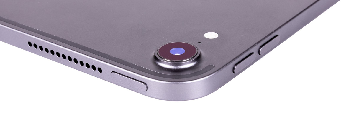
While i don’t like camera bumps, I can at least make an argument for them on a phone. Here again though, the iPad Pro isn’t a phone; it’s a tablet. It’s already a big device, making it big enough cleanly integrate the camera flush with the surface doesn’t have nearly the kind of impact on overall size and handling as it does on a phone.
What’s worse, is that a big camera in the iPad Pro is something I find to be of questionable value; though I’ll come back to this in a bit.
At least Apple used a sapphire crystal over the lens. That at least addressed most of my concerns about scratching it. Though even that is adds expense to workaround a problem they created in the first place.
The second problem I have with the bump on the iPad Pro, is that unlike a phone I will frequently use my iPad with it laying on a desk. Apple’s pencil is a phenomenal tool for writing and sketching. However, in most cases when I’m writing, I work on a desktop not in my lap. The bump stops the iPad form sitting flat without a suitable case to take up the gap. It also means that the iPad’s body had to be designed to support greater bending loads as it becomes a bridge instead of lying flat on the desk.
No More Headphone Jack
The other casualty to thinness is the 3.5mm headphone jack, and for me this is a bit more frustrating than the camera bump.
Apple’s removal of the iPhone’s headphone jack was controversial, arguably premature, and not necessarily something I agreed with. However, there were at least reasonable arguments for doing it.
However, try as I can, I can’t make such arguments for the iPad Pro. It’s not a phone, and there isn’t remotely the same kind of real pressure minimize the thickness as there is in a phone. Moreover, it carries Pro branding, and I still firmly believe that should mean something more than just more expensive.
The meaning of pro is also something that Apple has been eroding, and it frustrates me to no end. There was a time when pro meant something more than just a more expensive but otherwise consumer product. The design reflected the idea that pros used their tools to do thing.
For a consumer, they may only ever deal with Apple products, and maybe only a phone and tablet or laptop. However, for a pro, there’s a lot more they have to make work together than just an Apple tablet.
This is my problem. My iPad Pro isn’t the only thing I have to use headphones with when I go out in the field. My cameras, audio recorders, and even laptop are all things I use wired headphones with. In no small part because that’s all some of them support. Moreover, given the requirements for latency and reliability that professional recordists the requirements for wired headphones aren’t going away anytime soon.
Granted, there are workarounds for this. I can use a USB-C audio dongle, or just get a second set of wireless headphones. However, all of this is so frustratingly typical of the modern Apple kludge first mentality. Because some executive wants something to be arbitrarily thinner, and a pro thing at that, the rest of us pay for that with inferior workarounds.
You can’t even convincingly tell me that the users who don’t use the headphone jack, are better off either. They got a device that’s 0.2mm thinner — to put that into perspective, that’s 4 sheets of paper savings — than the headphone jack equipped predecessors. Nor, given that these devices are more expensive than their predecessors, are we saving anything in the costs.
There’s No Real Up Side, and That’s a Good Thing
Grumbling aside, one aspect of the new iPad Pros I really like, is that there isn’t a preferred orientation anymore. Up is very much whatever direction is up when you’re holding the tablet.
While all previous iPads have rotated the display to match how you’re holding it, they’ve also had a home button that you regularly had to interact with. In effect, the ergonomics of the home button imposed preferred orientations on the device.
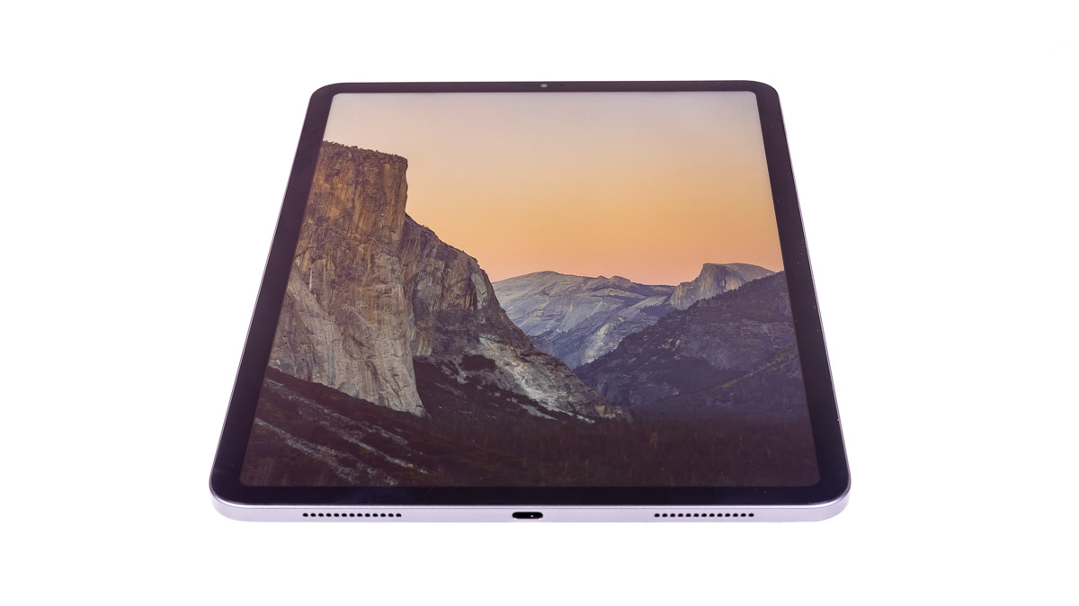
The 2018 iPad Pros have replaced the home button with the same gestures that the iPhone X uses — a swipe up from the bottom — and this gesture tracks the device’s orientation. Swiping up from the bottom is always swiping up from bottom of the screen as you’re holding it.
Add to this is the 4 speaker sound system always maintains stereo left/right positioning regardless of orientation, and there’s very little to make one orientation more preferable than another.
Moreover, while the lock and volume buttons still exists, their functions are either use much less frequently (e.g, with a smart cover, I almost never use the lock button), or can be accessed through the UI in other ways (e.g., the volume can be changed in the control center).
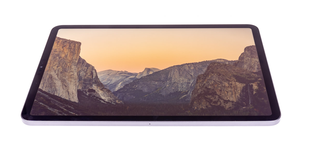
Overall Build Quality
These iPad Pros had their own little “scandal” shortly after release with factory “pre-bent” devices reaching consumers. Apple, didn’t do themselves any favors with their tone-deaf PR response either. That said, I’m not going to rehash the situation again, except to say in my opinion the people that got bent/warped iPad Pros got defective products, and Apple should have replaced them on the spot.
That said, I put a straight edge against my 11″ iPad Pro, and it’s dead flat. While that doesn’t make it any better for the people that got bent ones, it also doesn’t appear to be a systemic problem or a reason to avoid these iPad Pros.
In fact, all told, the build quality of mine is pretty much what I’ve come to expect from Apple: solid and well done.
Display
For me, the display has long been one of Apple’s big selling points in this space. Apple has history with the graphics arts fields, and that still permeates their products with an emphasis on things that are important to those types of users.
For me, this comes across in a number of ways with Appel’s display choices.
First, Apple’s uses a squarer aspect ratio than most of the competition.
I like the more square aspect ratio as it fits better with most of the images I work with. The vast majority of my single frame images, are either 1.5:1 (3:2) aspect, the same as the camera’s sensor, or cropped to something squarer, typically to 1.25:1 (5:4) for printing such as for a 16×20.
While the 1.43:1 aspect ratio of the iPad Pro doesn’t completely match either of those, it’s a way better compromise than 1.77:1 (16:9), or even the 1.6:1 that Samsung uses on some of their Note tablets.
More broadly, I find the more square aspect ratio is generally more comfortable for me all around. When I’ve used 16:9 tablets, I’ve always found everything felt squished to me. Either it was too narrow in portrait, or too short in landscape.
Secondly, Apple focuses on good color performance and accuracy.
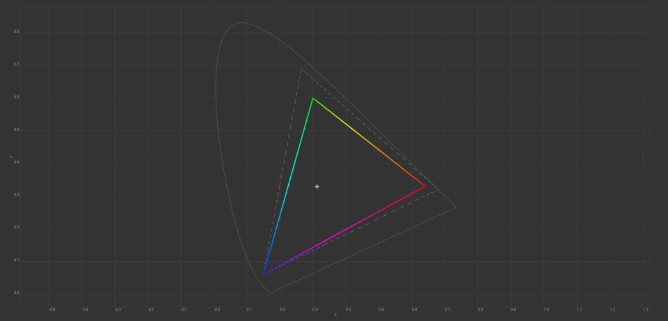
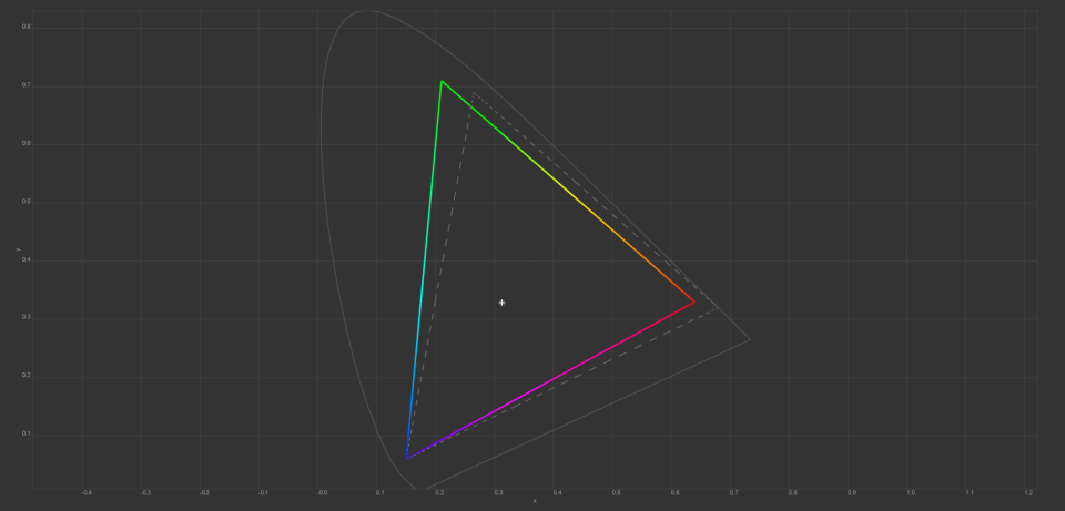
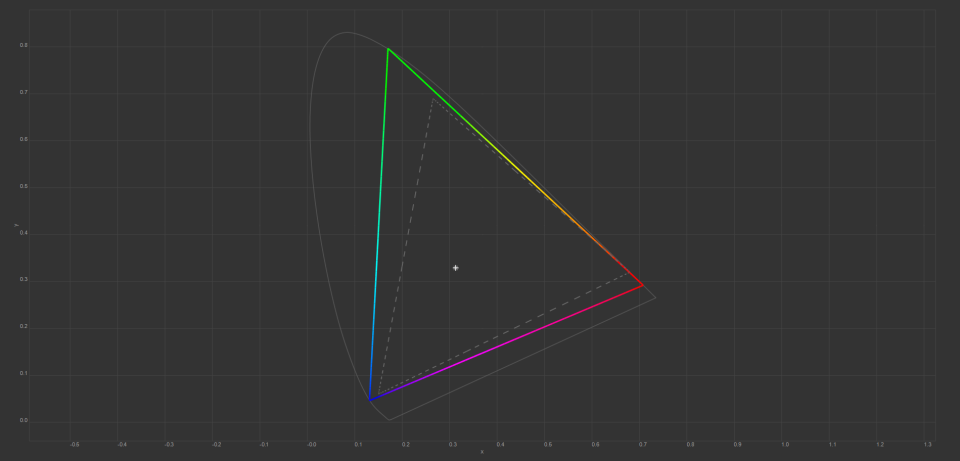
Most recent Apple devices, including this iPad Pro, use the P3 color space. This is a mid-way compromise between the old sRGB standard and the very wide gamut color space of REC/BT 2020 UDHTV standard. Moreover, P3 compares fairly well in overall size to Adobe’s RGB color space as well, though it doesn’t completely overlap it.
A wide color gamut isn’t the only thing that matters though; getting colors right matters too. Moreover, on a device like the iPad where you can’t reprofile the display regularly, an accurate factory calibration is important. Fortunately, the iPad Pro’s color accuracy seems to be close to spot on. In their worst measurements, Anandtech[1] measured a delta-E of less than 2, putting their test samples well within the point of not being able to distinguish color errors.
On the topic of color, one thing worth mentioning is that when accurate color is necessary, both True Tone and Night Shift must be disabled.
That said, it’s not always necessary to have completely accurate colors. For example, when I’m reading, or just generally using the device, the warmer colors of Ture Tone and Night Shift are slightly easier on my eyes in many cases. Even when looking at images, unless it’s a critical meeting with an advertising agency where the image’s color must match the colors on the actual product, having True Tone isn’t really a problem.
Then there’s Apple’s retina display, or rather their not over the top retina display. Where some companies have rushed to put 4K displays in tablets, the result are invariably a waste of pixels and power consumption to drive them. Apple’s displays consistently hit a resolution sweet spot. They’re not such absurdly high resolution that it wastes power for no added benefit, and yet still high enough to make the individual pixels indiscernible.
Finally, there’s the anti-reflective coating. Apple’s engineers really knocked this one out of the park.
When it comes to displays, I’ve never liked glossy ones. They reflect far too much incidental light from the room and it gets distracting. However, the coatings on the 2018 iPad Pro result in the lowest reflectivity I’ve seen on what’s still a glossy display, and do a fantastic job of not reflecting incidental lights in distracting ways.
Cameras
There’s no real good way to say this without just coming out and saying it. I couldn’t care less about the cameras. In fact, I have more positive things to say about the camera in my iPhone 8 than I do about these.
It seems to me, that there’s an entire mythos around the cameras in phones and tablets — which are often very similar if not the same hardware — being able to replace standalone cameras. However, they don’t cut it for me,.
These tiny cameras are good enough for machine vision applications (e.g., augmented reality or reading bar codes), and under the very best conditions they’re better than horrible at photos. But they have to be in almost perfect conditions to produce anything approaching a reasonably good image.
The bigger problem with the cameras on the iPad Pro, isn’t so much the cameras themselves, but trying to use a tablet as a camera. The ergonomics are simply a disaster. It’s a horrible combination of unsteady point and shoot handling and trying to take a picture while holding a computer monitor.
In a very twisted way, Apple seems to recognize this too. While the resolution is similar to the iPhone’s cameras, these cameras lack optical image stabilization. You might even call it a funny omission in a so-called “pro” product.
In fact, and maybe this is just the real irony of it. The camera in my iPhone 8 vastly more useful to me, and it gets used vastly more than the camera in this tablet or any previous ones.
Why?
Simply because package is much more conducive to being held and used as a camera. The phone is smaller, lighter, and a can be manipulated one handed, while the tablet is just too big for that. Moreover, the optical IS really helps with the camera shake given the less than ideal ergonomics, especially when holding it one handed.
In fact, I’d take things a step further. Given that Apple was able to flush mount the 7 MP selfie camera in the bezel, I would have been more than happy for them to have used the same camera assembly to flush mount the regular camera as well and dumped the bump. Simply put the 12 MP camera, is more camera than the iPad Pro really needs. Either Apple should have gone full tilt, and integrated the iPhone XS’s camera system or cleaned up the design with a lower resolution but smaller flush mounted camera.
Face ID
On first glance, Face ID sounds like a neat feature. Moreover, Apple claims it’s more secure than Touch ID. Consequently, they’ve been transitioning mobile devices to Face ID and removing any touch ID implementations.
This is another place where the theory sounds better than the practice, at least to an extent.
When Face ID works, it works really well. If I pick up my iPad and open the cover, it’ll be unlocked before I can swipe up.
However, there are a lot of places where the Face ID runs into problems. One example is when the iPad is sitting on a desk and I’m standing. Usually in this case it complains that I’m too far away from it for Face ID to work. This wasn’t a problem with touch ID, since I already had hands on the device, and touching the thumb sensor didn’t require me to move.
The other time I run into a lot of Face ID failures is when I’m sitting and go to use it while it’s flat on a desk. In this case, the camera won’t see my face, because it’s well below the bottom edge of the iPad Pro.
In both of these cases I can lean in for a second to get Face ID to unlock. However, at the same time, it is a bit more cumbersome than Touch ID was.
In using this it’s clear to me that Apple didn’t really think through the differences in usage between a phone and an 11″ tablet. The phone’s small screen makes it hard to use see at arms length, a in most cases you’re going to pick it up to use it anyway. However, an 11″ tablet can be see clearly on a desk or at arms length. In both of these situations, Touch ID put the sensor and the input together to start with. Face ID’s camera based sensing doesn’t do that.
USB-C
Aside from the display, the iPad Pro’s biggest tangible improvement is the USB type-c connector. The lists of benefits of this are pretty substantial. However, it’s also yet another place where iOS handcuffs you with limitations.
Before I talk about the problems, let met start with the positives.
To start with, the USB-C does allow faster charging.
The 11″ iPad Pro has a nearly 30Wh battery (technically it’s 29.37 wH). Using a regular 10 W charger (2A at 5V, the max for regular USB), it takes 3 hours to recharge. However, the iPad Pro comes with an 18W (2A @ 9V) USB-C charger, which cuts the recharge time down to a mere 1.5 hours.
While this isn’t an order of magnitude improvement, it is a factor of 2 improvement and at the time scales in question it’s a pretty big deal. Moreover, it’s possible that the iPad Pro may charge at higher powers if you have a suitable charger for it; I don’t, so I can’t test that.
While I don’t use the 18W charger a lot, since I usually charge my iPad Pro from my multiport USB charger over night anyway, it is a nice feature when you start thinking about the iPad Pro as as computer not just a content consumption device. Moreover, with the A12X being a 5-15W class CPU you should be able to charge at a reasonable rate while the CPU is running at max power consumption.
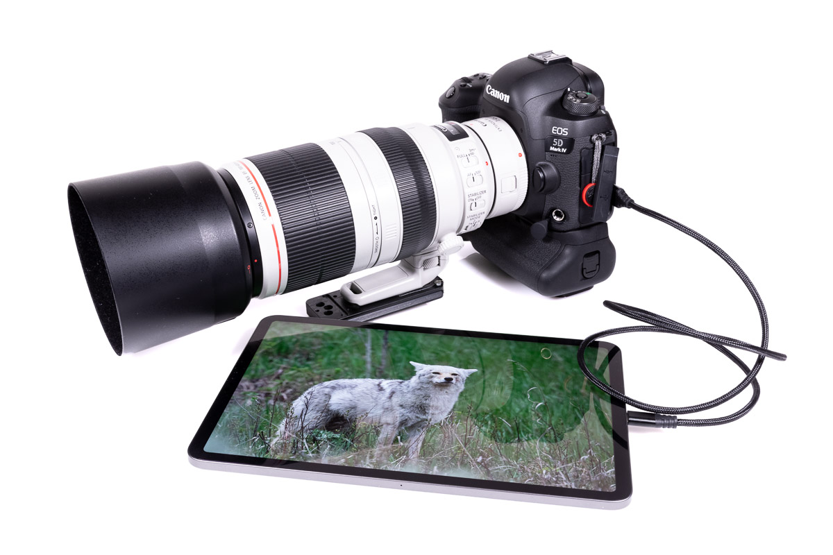
However, unlike most other mobile devices, the USB-C port isn’t just for charging. In fact, Apple’s marketing makes a big deal about using it to connect devices, like cameras, to the iPad Pro.
To start with, Apple has actually implemented some USB-C alt modes. The iPad pro supports the Display Port 1.3 out over USB-C, allowing the device to drive to up a a 5120 x 2880 resolution display at 60 Hz. All you need for this is an inexpensive type-c to Display Port cable, no expensive converters required.
Unfortunately, when it comes to alt modes, Apple doesn’t seem to provide a list of what the port supports. I’ve tested the Display Port out, and it works. However, it’s capabilities are limited. The aspect ratio is the same as the iPad’s, and can’t be changed. Moreover, the utility of the display depends on the app. Some apps, like Keynote, can use the external display to show a presentation while using the internal display to show speaker’s notes. Most everything else, is just mirrored across both displays.
Aside from the display port alt modes, the iPad Pro acts as a USB host device allowing you to connect cameras, card readers, storage devices to the type-c port. However, that comes with the catch that iOS’s ability to do things with those devices is limited.
To start with, there’s no way to add drivers to iOS. Consequently, if you’re device doesn’t behave as a standard USB class device, it’s not going to work.
The bigger problem is that you could best describe the iOS as a content vacuum. You can get content on it relatively easily, but getting it off is a much bigger hassle.
Moreover, the sandboxed nature of iOS apps and the lack of a proper shared document store/file system means that there are lots limitations with the software available on iOS.
For instance, photos and videos imported into the Photos app can be copied off the device by plugging it into a computer where it will show up as a camera.
However, this doesn’t help if you’re running out of space in the field and want to move data off the iPad to an external USB drive. IOS simply doesn’t support generic external storage like this. Worse, from what I’ve been reading, Apple isn’t interested in supporting this either. Instead they seem to want to rely on storage makers, such as Western Digital, or LaCie, to handle this as part of the software that goes with their portable disks.
Because of this, there’s no real viable way to work with large amounts of data without buying the largest 1TB model of the iPad Pro. Even then, especially when shooting video, it’s quite possible to generate more than 1TB in short order. For 500 Mbps production quality 4K footage, 1 TB will only hold 5 hours of shooting. Moreover, you have to also factor in space lost to apps, the OS, and other content that might be on the device.
My complaint here goes back to what I’ve been saying about the A12X giving the iPad Pro serious compute power. Without the ability to move data easily on and off of the iPad Pro, you’re much more constrained in how you can really use the device in a way that you wouldn’t be on even a less powerful MacBook Air or PC laptop.
For example, with my MacBook Pro even though I only have 500 GB of internal storage, I can supplement that with as much external storage as I need. If I’m working in Lightroom, it’s more than capable of dealing with images on both the internal and external drives, and I can easily share everything on my network when I get home and transfer all the data back onto my server and workstation directly.
However, with the iPad Pro, I can get the data on it easily enough. However, if I run out of space, I can’t plug an external drive in to make more. Moreover, it’s not entirely clear how I get the data off yet either. Lightroom CC Mobile, for example, wants to sync everything up to Adobe’s cloud, which may be fine for a few small images, but it’s not going to work for 200 or 500 GB of images.
Moreover, because there’s no way to upgrade the iPad’s storage, you have to guess at your needs and buy something that’s big enough; and that gets expensive all things considered.
For example, I have a 256GB iPad Pro[2], that’s already a $950 device — and that doesn’t include the $300 additional for a pencil and smart keyboard cover. Stepping up the 1TB version raises the price to $1550. The 1 TB 12.9″ version with cellular is $1900.
To put some perspective on that, for $1300, I can get a 13″ MacBook Air, with 16GB of RAM and 256 GB of storage. And for $2000, I can get a 13″ MacBook Pro with a similar RAM and storage config.
While both of those options only have 256GB of built-in storage, I can plug in a USB drive and work with virtually no limits. Moreover, since it’s a Mac, I can use the software I already own and know, and can just connect it to my network and share the images and Lightroom catalog files to get them off of it.
With iOS this isn’t a possibility.
Ultimately, this is one of the bigger problems for me across the board. The “consumption” mentality of the iPad environment wants you to put stuff on it, but not get it back off.
That said, there may be some tiny glimmer of hope in this respect, as Apple has allegedly said that they would permit portable storage makers to produce apps that would allow them to write to external drives. This isn’t great, iOS should really support this natively, but it’s better than nothing. Moreover, the APIs potentially open the door for 3rd party file browser makers to do the same thing but for generic USB disks.
Moreover, Adobe is bringing a fully featured version of Photoshop to iOS for these devices. While that’s not a fully featured version of Lightroom, that may be in the cards in the future too.
Ultimately, this is the part where I get most frustrated with the whole iOS ecosystem now that I have a beast of an iPad Pro. The iPad Pro has one heck of a processor in it, and one I’d love to be able to take advantage of in the field; especially if it meant I could leave the laptop at home. However, those capabilities are so hamstrung by the inability to easily integrate it into any existing multi-platform workflow especially without having to be reliant on cloud services and non-local network connections.
Moreover, it seems like Apple’s approach to this isn’t to take the lead and really make the iPad Pro in to what their marketers want to sell it as.
Pencil 2
 Apple’s Pencil is probably the strongest thing going for the iPad experience over pretty much all of its competitors. Simultaneously, it’s also probably the biggest real liability and annoyance I have with the 11″ iPad Pro so far.
I’ve been using pen input “tablets” since the mid 2000s. At the time, PC makers were offering convertible laptop/tablets to go with Microsoft’s pen enabled Windows XP.
Back then, I was studying computer engineering so this was a good deal for me. I needed a laptop to work on between classes, and the tablet mode meant I could use it instead of a stack of notebooks to take notes on during lectures.
Of course, in the mid 2000s, the capabilities were much more limited. The display was only 1024 x 768, and while the pen used Wacom’s digitizer technology, in conjunction with the low resolution screen writing ended up just being chunky. That said, it did work well enough all things considered, and it certainly interested me in pen input.
When I outgrew the performance limitations of that computer, I ended up moving away from pen input for a while. I came back to it a couple of years ago when I started looking for a pen for my iPad Air 2 for sketching illustrations. At the time I wanted an iPad Pro and pencil, but wasn’t sure if I would really be able to ditch paper in favor of it. I ended up buying a Adonit Pixel instead.
In some ways, the Pixel is a superior product to the Pencil 2. Namely due to it’s shortcut buttons and extremely good battery life. However, in the most important way, writing performance, it’s a pale shadow of the pencil.
All told, I really tried to get behind the Pixel, but when push came to shove, if I needed to jot down a quick note, or do some algebra, I always reached for a sheet of paper and a regular pencil.
This is not the case with the Pencil 2.
The combination of the high resolution screen and Apple’s ultra low latency processing with the pencil makes it a dream to write with. Aside from the surface texture not being the same as paper — which I’ve gotten use to — the writing experience is very close to that of writing with a pen or pencil.
Further, I wouldn’t call my handwriting is tiny, but it’s always been smaller than any pen-enabled tablet I’ve used has been able to really handle. Not so with the Pencil and iPad Pro. My writing on the iPad is virtually the same size as it normally is on paper with a 0.5 mm mechanical pencil.
In fact, the writing experience is good enough that I’m not grabbing paper anymore to write notes or do algebra. That alone I think is a staggering testament.
That said, the drawing experience is something I’m still struggling with. Though the problems I’m having may have less to do with the pencil and more to do with the software and my own limitations.
In some respects, Apple’s Notes is okay, but it has it’s share of problems too. What I do like is the way Apple implemented the ruler too. However, a lot of other aspects have me looking for more capable solutions.
There in lies the problem, at least for me. I’ve yet to find anything that was both more featured than the Notes, and yet implemented things quite as effectively as Notes does too. That said, I’m willing to admit that maybe it’s just me, and that I’ll have to relearn how to sketch and draw on a tablet.
Which brings me to the real problems with Pencil.
With the Pencil 2 Apple changed the charging solution from a Lightning connector in the “eraser” end of the pencil to a magnetically attached inductive solution. Overall the solution is very elegant, and should be a real selling point. Storage and charging all in one convenient location.
Charging is quite fast too. I’ve charged the Pencil 2 from ~15% to 100% in less than 30 minutes. You can certainly top it off with enough juice to get some work done with only a minute or two of charging.
Likewise, I really like the magnetic docking solution. The magnets are strong enough to hold it securely, and you don’t have to deal with a case with a strap for the pencil.

That said, I’ve had no end of problems with the Pencil draining excessive amounts of battery power seemingly at random when attached to the iPad. I’ve seen my iPad’s battery drop 10-15% over the course of an hour, but only at odd times (usually after everything has been idle for several hours) and only when the Pencil is attached. For example, I’ve seen the battery drop off between say 6 and 7 AM while I’m asleep and the iPad is just sitting on my desk as it has all night.
It’s these battery drops that are the liability. On its own my iPad Pro will sleep for days without any appreciable battery drain. However, attach the pencil, and the iPad can’t make it for more than a couple of days before it has to be recharged due to these oddball drops.
Yes, with charging the Pencil from the iPad some battery drop is expected. However, in testing a full recharge the Pencil’s battery consumes only about 1% of the 11″ iPad Pro’s battery life. Moreover, the iPad with the Pencil docked will sit idle not using any power for hours on end, then suddenly something happens and the iPad’s battery starts draining.
Part of the problem here is the way Apple has coupled both charging and attaching the Pencil to the iPad. You can’t turn off the charging function in iOS, the only way to keep the iPad from charging the Pencil is to not attach it. However, attaching it is easily the best way to carry the Pencil and have it hand when you want to use it.
Fortunately, both the iPad and Pencil can have their firmware updated. Which means it’s possible for Apple to fix this in the future. Unfortunately, I can’t really tell how widespread this issue I’m seeing is. Until then, I just have to keep my Pencil on my desk unless I’m charging it. As for traveling with the Pencil, well, time will have to tell on that one.
My final complaint about the pencil isn’t so much a complaint about the pencil, as much as a complaint about iOS’s support. Handwriting support is only available in places that are designed to take pen input, it’s not universally supported across the OS. In other places, like the address bar in Safari, you can tap it with the Pencil to select it, but that just brings up the standard virtual keyboard. There’s no handwriting to text engine that you can use to fill out these kinds of text boxes.
This wouldn’t be such an annoyance, except I could do this in Windows XP on a processor with way less than 1/10 the performance of the A12X, it seems like a pretty glairing omission to me.
Typing: Physical and Virtual Keyboards
When I’m not doing photography, I’m usually writing about it. In fact, writing makes up a significant amount of the time I spend on my computers. For me, if Apple wants the iPad to be the computer that’s more than a computer, the typing experience is a big part of that.
I’ll start with the virtual keyboard, since it’s the most “built in” part of the system.
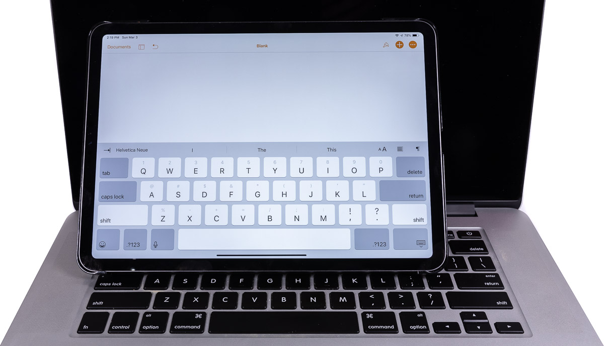
I feel like a bit of a broken record in saying this, but like usual Apple can’t go about things consistently. While it makes sense that the iPhone and iPad would have different keyboards, simply due to the different sizes. Apple has also decided that the iPad and iPad Pros should have different keyboards as well, and I can’t fathom why.
What makes this worse, is that in a lot of ways I find the regular iPad’s keyboard superior.
At first glance, the differences are subtle, but it’s these subtle differences that make all the differences. The most glairing omission is that keyboard can’t be undocked from the bottom of the screen and positioned anywhere across the screen.
Moreover, the regular iPad keyboard allows you to split the keyboard in to two smaller “thumb” keyboards that stick to the side of the screen that you can use with your thumbs. In a lot of cases, I find this configuration to be substantially more comfortable to enter things like web addresses and what not than a big keyboard on the bottom. Again, this is not supported by the iPad Pro.
The other option is a hardware keyboard.
In my limited testing, this is moderately problematic too. Though I have to admit, I haven’t tried Apple’s Smart keyboard cover. At $180, that’s a lot of money for what’s still a small keyboard.
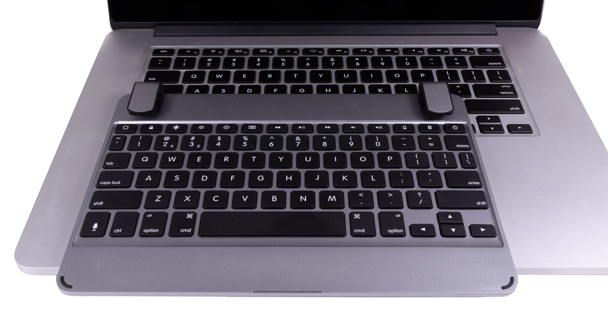
Part of the problem with most of the dedicated keyboard solutions, including Apple’s is size. The 11″ iPad Pro isn’t very big, and that makes it a squeeze to get a keyboard in it’s footprint.
For example, I have a 9.7″ Brydge Keyboard(Affiliate Link) from my iPad Air 2. While it’s not directly compatible with the iPad pro, the size differences are basically immaterial. I find this keyboard frustratingly impossible to type on. I can do around 70 WPM on my full-size desktop keyboard, and basically the same on my 15″ MacBook Pro’s keyboard, but squish things down to this size and my typing speed drops to barely 10 WPM.
Then there’s the final point, which is the keyboard isn’t part of the price. Previously I made a comparison between the 13″ MacBook Air and the iPad Pros, and in that I was extremely generous to the iPad Pros in terms of value. With a keyboard and a pencil, you add $308 to cost of the iPad Pro over a Mac. That covers 75% of the cost of upgrading the MacBook Air to 16 GB of RAM and 512 GB of storage.
GPS
Unfortunately, this is another place where Apple could have distinguished the pro devices from the regular iPads in some way: always including GPS support across the board.
Unfortunately, Apple only provides GPS support on their cellular equipped devices. The technical reason for this is that the GPS support is provided by the cellular baseband processor (e.g., the Intel XMM 7560 ). The Wi-Fi versions don’t have these chips, and therefore they don’t have GPS capabilities.
Some might argue that without having cellular support, the GPS is not as necessary. However, most mapping apps allow you to download map data to the device so they can work without a cellular connection. However, without GPS data, you lose the live location and navigation capabilities even though you have the map data locally.
When it comes to iPads, what this means is that you can’t use the big screen of your iPad for navigation effectively when you don’t have a fixed Wi-Fi signal, such as when driving or hiking in more remote areas.
While I can appreciate the technical aspects of this, its still frustrating to me.
Conclusions
When push comes to shove, I’m really torn on the 2018 iPad Pros.
On one hand, there’s clearly so much potential in the device. On the other, Apple’s iOS ecosystem and OS limits what it can do so badly that it’s hard take advantage of that performance.
Ultimately, for me I think the biggest problem with the 2018 iPad Pros are their price tags.
Sure there’s value in a tablet form factor, and the pencil is really nice. But for me at least, the few plus, even ones I can’t get elsewhere, don’t outweigh the limitations of iOS and the app ecosystem (at least right now). That’s not to say that the devices are bad, but I do think they’re over priced for what they offer.
Comments
Well done for a comprehensive post. For me, it all boils down to
1. Ability to get files quickly on and off the device without complex 3rd party workarounds.
2. Ability to use a mouse.
Both of these are in Apple’s control.
If ios 13 does not enable full usb c functionality, then my next in field mobile device will be a Dell xps compact laptop.
Also, unless there is a major change in Apple iphone pricing, my next mobile will be Samsung. I have already decided that my next workstation will be a custom build Windows machine, with highest spec memory, cpu and I/o m2 based drives.
It looks like I am leaving the Apple eco system.
Ios 13 is last chance soloon for me and Apple.
I pretty much agree across the board.
My only, and really biggest, problem with leaving iOS though is my extended family. Almost all of them use iDevices, and aren’t going to be bothered by trying to figure out 3rd party alternatives for stuff like Facetime. Especially my 90-odd year old grandmother. Moreover, I don’t want to instigate a change that ends up making me the support guy that everybody calls when they have a problem. I already did that once, and it took nearly 10 years go dig myself out of that hole.